It's been a while since I've evaluated a new app for DFA a1 determination. We have some great choices already, so why do we need another? Looking at the app matrix, there is a gap for any option that will track a1 on the PC in real time. Some users have high end PC towers with large screen Zwift implementations and could benefit from a secondary display showing a1, HR, power. Or others just have a spare laptop around to track metrics. This post will review a new app "Fitness Dashboard" that although still in the alpha stage, has some impressive features that may appeal to a wide audience.
The idea behind Fitness Dashboard is to track almost any Ant+ metric as well as eventually bluetooth Polar H10 ECG on a real time continuous basis. For now, I will confine my comments to how well the app handles DFA a1 and how well it agrees to Kubios HRV software. By way of background, a successful implementation of DFA a1 HRV calculation should adhere to the Kubios methodology since all of the published validation studies for threshold determination were done using these procedures. The apps that have reverse engineered Kubios a1 calculations include Runalyze, AIendurance and Fatmaxxer. The alphaHRV for Garmin does not, but it seems to track well regardless. The second issue to discuss is how well does the app correct for artifacts. As has been shown, the Kubios automatic method is superior to the "threshold" method, but is only available in Kubios premium (until now). The above mentioned apps all use the threshold method which is fine under most circumstances. However, Fitness Dashboard has been designed to use the automatic method, previously only available in Kubios premium!
To sum up, Fitness Dashboard is a PC based app to track DFA a1, Ant+ device output (power, muscle O2, Core temp, speed, cadence) and eventually ECG (Polar H10) and utilizes Kubios HRV software methods for detrending/preprocessing and uses the more robust artifact correction method (automatic).
Richard Wharton has done a video review about Dashboard features with some nice graphics.
Sample of the display:

In the above screenshot, the red arrow is pointing to a1, the green to power (the start of an interval). The a1 tracks down to the .25 range toward the end of a 6 minute interval at MLSS+10w, then recovers at a lower power.
How does it track?
Test set up - Polar H10 with bluetooth going to Fatmaxxer and Garmin watch, Ant+ to the Fitness Dashboard app. Elite trainer with Assioma Duo pedals for power. Upload the Garmin data to AIEndurance and extract the pertinent data from Fatmaxxer feature file. Fitness Dashboard also has a features file. Kubios artifact correction method set to "automatic"
Two hour mixed session:

All apps seem to track a1 quite well throughout the 2 hours and various intensity ranges.
A zoomed view during 6 minutes at MLSS+10w (zone 3) same as above first figure:

- Superb agreement of all 3 apps with Kubios
- No issue with any app not reaching low a1 levels (seen with some non Kubios detrending methods).
Now for the interesting part - I had a run of many atrial premature complexes (APC) that were easily seen on my Movesense ECG sensor tracing (yeah, I wore that too):
The top panel is the ECG (with QRS complexes), the green circled being the premature beats. The bottom panel is the HR (or RR). In Kubios it's easy to see premature beats since the HR will go up from the short RR then immediately drop from the longer RR (the gray zone in the bottom pane). Not related to this post - this is a great example why a continuous ECG can be helpful to understand why artifacts are occurring.

How do the apps handle these APCs?

- Only Fitness Dashboard is able to match Kubios Premium since both are using the automatic correction method of Lipponen and Tarvainen.
- This does not mean that Aiendurance or Fatmaxxer is "wrong", they are just using a different correction method that under certain circumstances is not as robust. If we used the same threshold method seen in Kubios free, the same a1 false suppression would have been seen.
Why is the automatic method "better"?
The key to the automatic method is that it not only looks backwards for the proper RR pattern but also looks forwards:
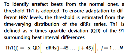
The downside to this is that there is going to be a small lag in each a1 displayed in real-time - therefore if you were following Fatmaxxer and Dashboard simultaneously, they may not perfectly match. The "look forward" is 45 beats which at a HR of 135 is about 20 seconds. In my opinion the tradeoff is worth it - the automatic method is a real bonus.
Regression/Correlation - the higher the R2, the better the match to Kubios


- They are all good, but perhaps due to the (better) artifact correction method, the regression appears closer with Dashboard.
- Interesting that Fatmaxxer and AIEndurance are virtually identical.
Summary:
- Fitness Dashboard is an app that tracks multiple physiologic metrics in real time including DFA a1.
- It uses Kubios preprocessing methodology and the automatic artifact correction algorithm found in the Premium version.
- The degree of similarity to Kubios is excellent and definitely on par with the best apps out there (Runalyze, AIEndurance and Fatmaxxer).
- As an aside, many thanks to the developer who is a talented hardware/software engineer. This is well on it's way to being a professional level application for both athletic and professional users.
Heart rate variability during dynamic exercise
(To the FAQ The DFA a1 App Matrix )
- Firstbeat VO2 estimation - valid or voodoo?
- Heart rate variability during exercise - threshold testing
- Exercise in the heat and VO2 max estimation
- DFA alpha1, HRV complexity and polarized training
- HRV artifact avoidance vs correction, getting it right the first time
- VT1 correlation to HRV indexes - revisited
- DFA a1 and Zone 1 limits - the effect of Kubios artifact correction
- HRV artifact effects on DFA a1 using alternate software
- First article on DFA a1 and Zone 1 demarcation
- DFA a1 vs intensity metrics via ramp vs constant power intervals
- DFA a1 decline with intensity, effect of elevated skin temperature
- Fractal Correlation Properties of Heart Rate Variability (DFA a1): A New Biomarker for Intensity Distribution in Endurance Exercise
- Movesense Medical ECG V2.0 Firmware brief review
- Movesense Medical ECG - improving the waveform and HRV accuracy
- DFA a1 and the aerobic threshold, video conference presentation
- DFA a1 - running ramp and sample rate observations with the Movesense ECG
- DFA a1 calculation - Kubios vs Python mini validation
- Frontiers in Physiology - Validation of DFA a1 as a marker of VT1
- Real time Aerobic thresholds and polarized training with HRV Logger
- Active Recovery with HRV Logger
- DFA a1 and exercise intensity FAQ
- DFA a1 agreement using Polar H10, ECG, HRV logger
- DFA a1 post HIT, and as marker of fatigue
- DFA a1 stability over longer exercise times
- DFA a1, Sample rates and Device quirks
- DFA a1 and the HRVT2 - VT2/LT2
- Low DFA a1 while running - a possible fix?
- Runalyze vs Kubios DFA a1 agreement
- DFA a1 - Runalyze vs Kubios vs Logger results in a cyclist
- Best practices for Runalyze and DFA a1 thresholds
- ACSM - HRVT validation in a cardiac disease population
- FatMaxxer - a new app for real time a1
- Another look at indoor exercise without a fan
- ECG artifact strips from Fatmaxxer - a guide
- DFA a1 as a marker of endurance exercise fatigue
- To train hard or not, that's the question
- DFA a1 HRVT and Ramp slope
- DFA a1 and optimal HRM belt position
- DFA a1 threshold in a cardiac population
- Atrial fibrillation - warning signs from chest belt recordings
- Pitfalls in DFA a1 - Polar belt position
- AlphaHRV - the first native Garmin DFA a1 data field
- HRVT validation in Elite Triathletes
- The DFA a1 App Matrix
- New - Review in Frontiers in Physiology